Usability: A Critical Requirement
During my ongoing literature review I often discover interesting facts about things I’ve never thought about. Sometimes I can connect these facts with my own observations: The result is mostly a completely new idea why things are as they are. Maybe these ideas are new to you, too. Therefore I’ll share my new science based knowledge with you!
This week: This time, I think about the importance of a good usability as it helps to keep players immersed and affects the general entertainment of a computer game.
A good usability is an important goal in software development and game design as it allows users to operate a system with a high efficiency, effectiveness and satisfaction. Furthermore, the usability of a feature increases in importance the more frequently this feature is used. While a bad usability of a rare used feature can be annoying, a bad usability of a periodically required element can drastically reduce a user’s satisfaction with a product. In addition, it can result in a user’s impression that the development team has not put a lot of effort into the development of their product thus reducing the team’s reputation.
In the case of a computer game, usability also is critical for the purpose of keeping users immersed in the gameplay. When a feature is too difficult and complicated to use, it can break the immersion as it completely distracts players from the actual gameplay. Moreover, a bad system or interface design might cause some playability issues thus resulting in a high degree of frustration of the players.
The tolerance for usability issues, however, depends on the development team and the status of the game. While usability issues of an early access indy game are often accepted as the game is still in development and hence the usability will potentially be improved over time, it can cause a strong hit to a team’s reputation in the case of a professional game studio that released a fullprice title.
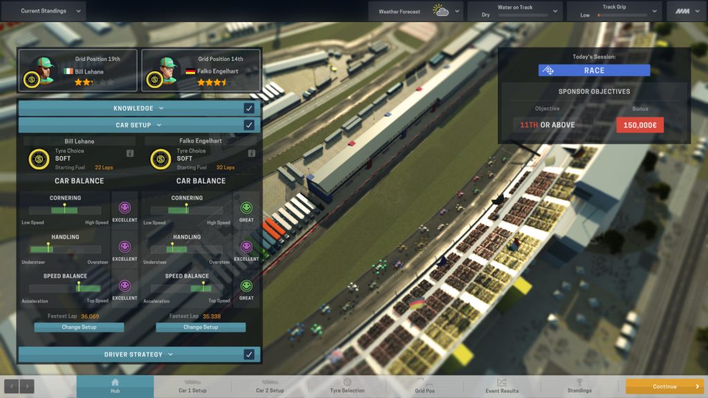
As usability is a well known and common concept, it all the time surprises me that many development teams seem to forget to do some playtesting in order to discover and solve those issues. Recently, I discussed the issues of Transport Fever which puts the player into the role of a transport company’s manager. In this management game, the player often can merely guess how the underlying principles work as they are not communicated properly. Recently, I got quite annoyed by the bad structure of DiRT 4’s menus.
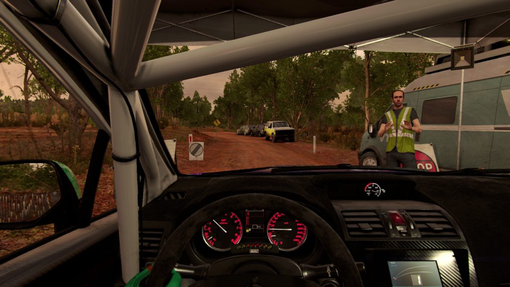
During the gameplay of DiRT 4, players not only compete in virtual rally events, but also manage their team and upgrade their cars. Unfortunately, the team management section is not well designed and results in an overcomplicated gameplay. For instance, players can unlock new facilities that provide a particular bonus, such as a larger garage or the ability to improve a car’s performance. Unfortunately, instead of allowing a player to directly install upgrades on a car from the garage menu that displays all purchased cars, players first have to start a new rally event. Once they are in the event’s service area, they can choose an option that allows them to upgrade the car used in this event. As a result of this, players need to start an event for each of their cars when they want to upgrade them simultaneously which causes a high degree of annoyance.
In sum, it is not only important to have well thought-out game mechanics, but also to connect them with a good user interface and to communicate all relevant information properly.


